Art Aisle

Application UX/UI Design
Duration: 32 hours
Tools Used: Figma, Google Forms, Adobe Illustrator
Project Overview
In the digital age, humans are now more connected than ever. Simultaneously, it can also seem like we face worse division than ever, especially along lines of identity. To combat this problem, how might we design a digital application that fosters community and celebrates inclusivity?
Project Role
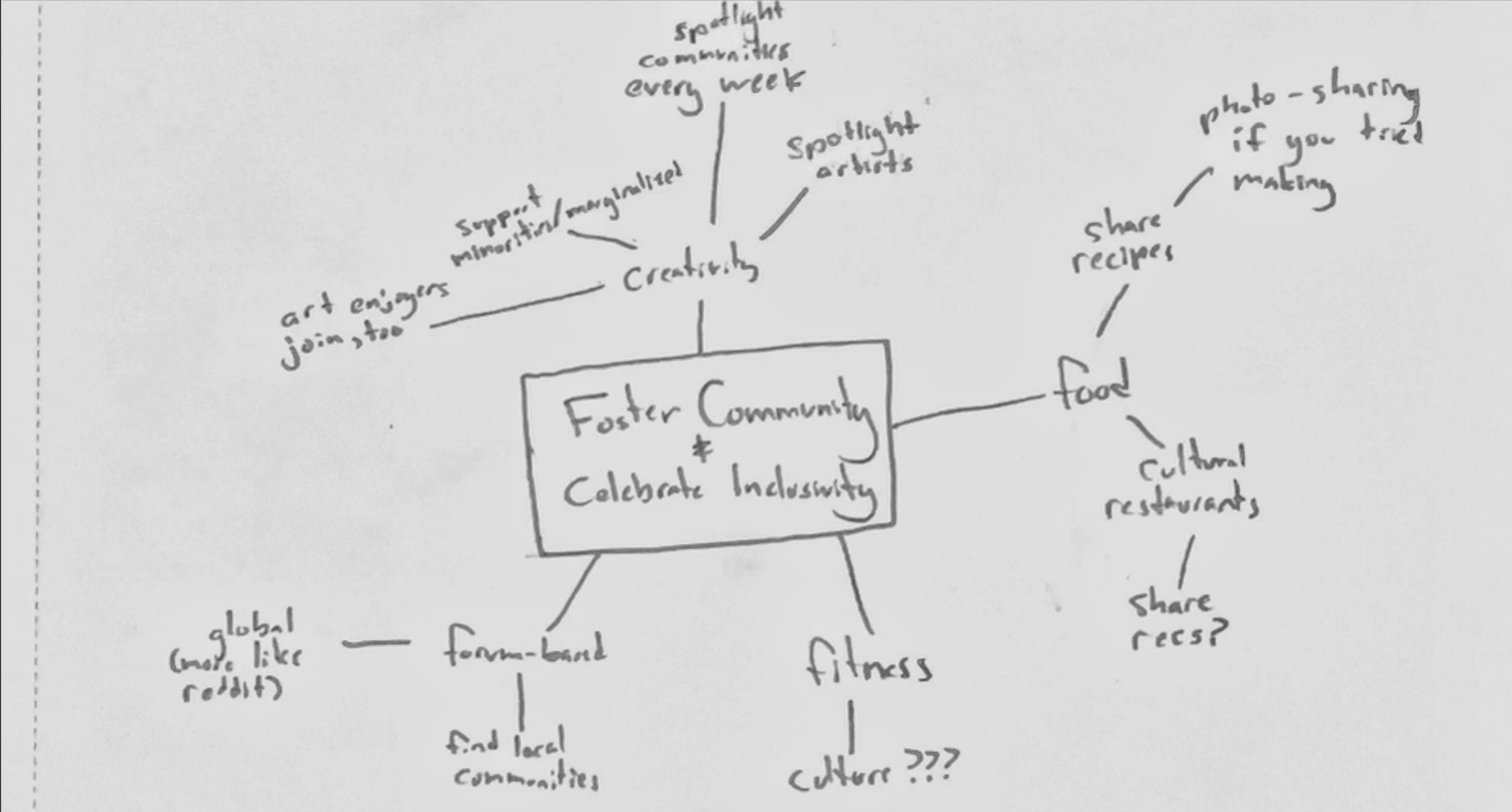
For this project, I served as one of four UI/UX Designers. Kicking off the project, I initiated the team ideation process, creating a mindmap with the other members.
Mindmap around Fostering Community and Celebrating Inclusivity
Once we had a few different ideas mapped out, we needed to decide which one had the highest probability of actually having a real and positive impact on users.

At first, we were leaning towards the idea of a forum-based app, where you are able to join communities and talk to people with similar identities and ideals either globally or locally. However, we soon realized that while this technically appeals to the widest audience due to how general it is, we would likely capture few people with an attempt to appeal to everyone.

Instead, it became apparent that it's more useful to have a well-defined purpose as an app, and to appeal to a particular user base, if our goal really is to create tangible change.

From here, we decided on the idea of an app centered around one of the few things that has the ability to connect us all — love of the arts! Every culture, subgroup, and identity has something unique and beautiful to contribute to the longstanding tradition of human creativity. So why not create a space to foster this deeper level of connection?
Choosing a Path
Ideation
After having a path decided on, we needed to learn about our intended user base in order to determine their needs, as well as what they aren't satisfied with in other existing mediums of sharing art.

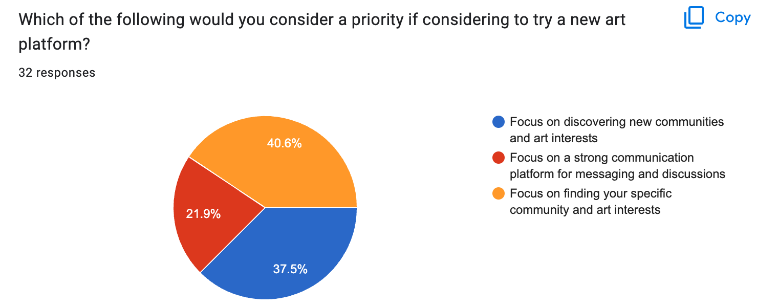
Forty responses to a Google Form later, we found that of those who do not already use social media to share or view art, 50% felt discovering new communities and art interests was a priority, and 37.5% felt find their specific community and art interests was more important in a new platform.

Of those who do use social media to share or view art, 40.6% felt finding their specific community and art interests was more important, and 37.5% felt discovering new communities and art interests was more important.

In both data sets, it was clear that there was a strong desire to connect with new communities and stay in touch with their own.
Meeting The Users
UX Research
Survey results
Using the information from the user survey, we then began envisioning a more fleshed out version of the app. To fulfill the stated user needs, we would need to provide a way for users to connect with communities they are already a part of, as well as a way to discover new ones.

Oftentimes, a good answer is just the most simple one. This is why we decided to simply add "Communities For You" and "Your Communities" sections to the home page.

Additionally, to really embrace the original goals of fostering community and celebrating inclusivity, we decided to prominently feature a different community on the home page each week. Since this is one of the most important goals of the application, we decided it should be hosted near the top of the page, to ensure all users see it.
The Blueprint
Wireframing
Art Aisle wireframes
With two wireframes detailing the two main pages on the Art Aisle application, my team and I began to create the prototype in Figma. The first step we undertook in this part of the design process was to develop a color palette for the app. Once we found one that we were all satisfied with, we started working on each different page.

Building on what we already had, we spoke with each other frequently, updating each other on what we were doing and what we needed help on.

After all pages had been designed, we began to connect the pages to create a user flow. The Figma prototype can be found here.
The Homestretch
Prototyping
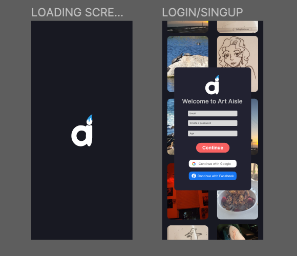
Art Aisle loading screen and sign up pageArt Aisle pages 1Art Aisle pages 2
Undertaking this project was hard work, but had a payout that was more than worth it. With only a day and a half to ideate, research, execute, and deliver, I learned valuable lessons in working with teams under short deadlines. Additionally, my team was not able to meet during the first night of the design challenge, giving us even less time to complete the project.

While the design process was something I was already very familiar with, being required to deliver a quality product under such pressure helped reveal where time is wasted most. This allowed me to be realize what steps of the design process I should strive to improve efficiency in. For this specific project, the pain points mainly lied in the initial ideation phase and the research process. If I could try again, I would try to increase team communication and try to not get too caught up on details that ultimately will not affect the final product.

If I had more time, I would likely have created more wireframes, iterated over the design process more times, and carefully created style guidelines before beginning the prototyping stage.

Overall, I am extremely grateful for this experience and I am happy to have been able to have such a dynamic team.
What's Next?
Reflection